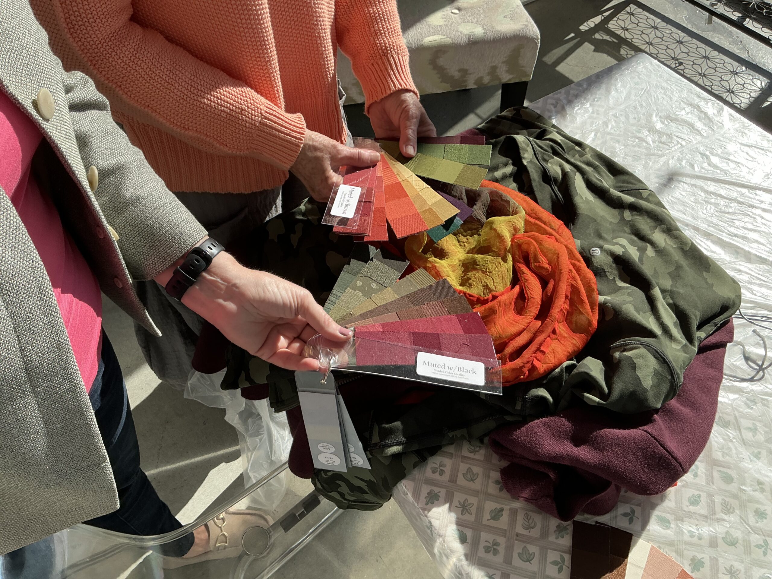
In fashion and interiors, color isn’t just an accent—it’s the element that defines the mood, market, and message of your work. Every designer, whether working with fabric or physical space, relies on color to communicate. Yet too often, it’s treated as instinct rather than strategy.
Color fluency is what separates amateur choices from professional results.
Why “Just Red” Isn’t Enough in Fashion
When a buyer asks for a red garment, it’s not enough to simply reach for any red swatch. You must ask: What kind of red?
· Temperature: A warm orange-red radiates energy and youth, while a cool blue-red suggests sophistication.
· Intensity: A bold, saturated red will command attention, perfect for trend-driven retail. A muted, dusty red feels timeless and upscale.
· Market fit: A teen brand might thrive on bold brights, while a luxury brand like Hermès leans toward rich, refined tones.
Fashion designers who understand the subtleties of color create collections that don’t just look cohesive—they connect with their audience on an emotional and commercial level.
Interiors: Selling With Emotion
For interior designers, color makes the difference between a design that sells or one that sits on the drawing board. People don’t remodel or build just homes; they want someone to design a space that makes them feel at home. Color is one of the things that can make a real difference.
· Warm neutrals like khaki or taupe suggest comfort and approachability.
· Cool grays and blues create sleek, modern sophistication.
· Accents of bold color—a pop of teal, a jewel-toned pillow—energize a space and make it memorable.
Interior designers who master color choices can instantly tailor a space to feel “just right” for the client, whether it’s a young family, a beach lover, or an urban professional.
The Designer’s Dilemma: Instinct vs. Intention
Many talented designers rely on intuition for color choices, and while instinct matters, it might fall short in unexpected ways. Clients may sense inconsistency, or spaces may feel “off” without clear reasoning why.
That’s where structured color knowledge comes in. By understanding hue, value, and intensity, designers gain a toolkit they can rely on—making choices intentional, consistent, and with confidence.
Why Training Matters
Design is too competitive for guesswork. The most successful designers don’t just have a good eye—they have a trained eye.
That’s what Color Kinetics provides. You’ll learn how to:
· Analyze colors by their hue, intensity, and value.
· Match the color quality of your palette to audiences and markets.
· Use color strategically to increase the appeal—and sales—of your work.
Begin with ColorKINETICS© Today.
Reserve your spot now—seats fill quickly!
Better yet, if you have questions, feel free to call Mary Lou Manlove at (650) 400-2230 to find out more.
